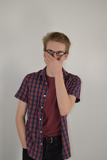
Going back through my preliminary work I have greatly improved in what I have
produced. First of all the camera shots and mise en scene in my photos are a much higher standard and are in a
different league when compared to my preliminaries, I put this down to the
location we used and better camera and camera skills. The is also an obvious
improve meant in the models since when I researched my target audience I used
clothe which fitted it better when I took the previous photos it was what ever
cloth they where wearing on the day. However on the front cover of my final product I have my model’s styled in a specific way eg a vintage brown
jacket from a charity shop skater hoodies and DocMartisns to make it relatable to the genre and audience so that
my magazine is unusual and embodies the theme of music and fashion, to attract
more readers/customers to read my magazine and to Bauer. The difference in
style is dew to my holes in my research when creating my preliminary and only
going with my gut instinct the, and taking the
images on plain white background caused me to have to use the wand/lasso
tool to cut out the model and awkwardly place it upon my magazine, however
contrary to this when I took the images for the real project I used a natural
background so that the centerpiece was a nice piece of photography and that it
didn't need to be a Frankenstein jumble of images and
background, my camera skills also improved and i
used more long shots and used the natural light to my advantage whilst as
before the artificial lights caused glare and the close ups looked forced and
only where able to fit 1 model.
During the preliminary work I felt that my type faces where dreadful since they
where the base Photoshop fonts and where not inspired by any other conventions , however this did help me learn
toward my final product that knowing which fonts are more professional and
appropriate which allowed me to make my final product as professional and higher quality as I could. However
on my final product I
researched what other magazine conventions and could let this inspire me such as
developing the clash lay out for the inside and the vice layout for the cover
whilst utilizing a similar font to the vintage kerrang!’s, I browsed fonts to see which would suite me on a website called DaFont and then download
the font on the Mac so I
could utilize it in lesson. From this I under stand the hardship and importance of research and development to allow
you to under stand what is best for your creation eg which fonts
are appropriate and suitable for my products. The organization and
placing of the text on my
pages is completely different,
I did however try to keep it minimalist yet I Put the masthead all the way
across the top of the page witch I found I disliked and used a different layout
of mast head and decided not use scattered boxes since I dint think it sat on
the page very neatly ,I Directly measured the conventions of Clash for the
purposes of orientate and left a white boarder along the edge of the
image so it doesn’t take any concentration away from the main image or text .
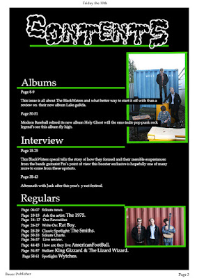
The design of my preliminary contents to final content page also shows allot of
improvement. When
producing my preliminary I did not consider how many pages a magazine averagely has and only randomly
pointed out a few pages whilst after research I found that the content id which
to uses a similar convention to lists all the pages and it go's up to about
140+, the layout design of my
preliminary magazine is
also very poor, since i was just coming
accustom to Photoshop on the Mac and also had little knowledge on the layout of
content pages especially a school magazine, during my research I found that
clash content was very simple and very effective yet I felt like I should ad
images to the page so that it didn't have lots of negative space.

The preliminary magazines was great to do to accustom ones self to the technology and help developed them skills it also helps boost photography skills, which are all important to get a grasp of before the real media product which then can be sculpted along side the all important research which allows any one from all backgrounds produce a good final media product.


No comments:
Post a Comment