Thursday, 6 April 2017
Monday, 3 April 2017
Saturday, 1 April 2017
Friday, 31 March 2017
Thursday, 30 March 2017
EVALUATION 7 'Looking back at your preliminary task (the school magazine task), what do you feel you have learnt in the progression from it to full product?'
Looking back at your preliminary task (the school magazine task), what do you feel you have learnt in the progression from it to full product?
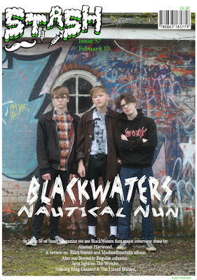
Going back through my preliminary work I have greatly improved in what I have produced. First of all the camera shots and mise en scene in my photos are a much higher standard that are in a different league when compared to my preliminaries, I put this down to the location we used and to a better camera used and camera skills. There is also an obvious improvement in the models since I researched my target audience I used clothes which fitted the demographic better, when I took the previous photos it was whatever clothes they were wearing on the day. However on the front cover of my final product I have my model’s styled in a specific way eg a vintage brown jacket from a charity shop, skater hoodies and DcMartisns to make it relatable to the genera and audience so that my magazine is unusual and embodies the theme of music and fashion, which would attract more readers/customers to read my magazine and to Bauer. The difference in style is due to my holes in my research when creating my preliminary and only going with my gut instinct, taking the images on plain white background caused me to have to use the wand/lasso tool to cut out the model and awkwardly place it upon my magazine, however contrary to this when I took the images for the real project I used a natural background so that the centerpiece was a nice piece of photography and that it didn't need to be a Frankenstein jumble of images and background, my camera skills also improved and I used more long shots and used the natural light to my advantage whilst as before the artificial lights caused glare, the close ups looked forced, but mainly I was only able to fit in 1 model.
Going back through my preliminary work I have greatly improved in what I have produced. First of all the camera shots and mise en scene in my photos are a much higher standard that are in a different league when compared to my preliminaries, I put this down to the location we used and to a better camera used and camera skills. There is also an obvious improvement in the models since I researched my target audience I used clothes which fitted the demographic better, when I took the previous photos it was whatever clothes they were wearing on the day. However on the front cover of my final product I have my model’s styled in a specific way eg a vintage brown jacket from a charity shop, skater hoodies and DcMartisns to make it relatable to the genera and audience so that my magazine is unusual and embodies the theme of music and fashion, which would attract more readers/customers to read my magazine and to Bauer. The difference in style is due to my holes in my research when creating my preliminary and only going with my gut instinct, taking the images on plain white background caused me to have to use the wand/lasso tool to cut out the model and awkwardly place it upon my magazine, however contrary to this when I took the images for the real project I used a natural background so that the centerpiece was a nice piece of photography and that it didn't need to be a Frankenstein jumble of images and background, my camera skills also improved and I used more long shots and used the natural light to my advantage whilst as before the artificial lights caused glare, the close ups looked forced, but mainly I was only able to fit in 1 model.
During the preliminary work I felt that my type faces
where dreadful since they where the base Photoshop fonts and where not inspired
by any other conventions, however this did help me learn for my final
product that knowing which fonts are more professional and appropriate this allowed me to make my final product as professional and higher quality as I
could. However on my final product I researched what other magazine conventions where appropriate and could let this inspire me, such as developing the clash lay out for the
inside and the vice layout for the cover whilst utilizing a similar font to the
vintage kerrang!’s. I browsed fonts to
see which would suite me on a website called DaFont and then downloaded the font on to the Mac so I could
utilize it in lesson. From this I understand the hardship and importance of
research and development to allow you to understand what is best for your
creation eg which fonts
are appropriate and suitable for my
products. The organization and placing of the text on my pages is completely
different, I did however try to keep it minimalist yet I put the masthead all
the way across the top of the page which I found I disliked which caused me to use a
different layout of mast head and decided not use scattered boxes since I didn't
think it sat on the page very neatly. I Directly measured the conventions of
Clash for the purposes of orientation and left a white boarder along the
edge of the image so it doesn’t take any concentration away from the
main image or text .
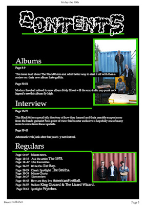
The design of my preliminary contents to final content
page also shows a lot of improvement. When producing my preliminary I did not
consider how many pages a magazine averagely has and only randomly pointed out
a few pages, whilst after research I found that the content in which I wanted to use was a
similar convention that would list all the pages in the magazine and there for it goes up to about 140+. The
layout design of my preliminary magazine is also very poor, since I was just coming
accustom to Photoshop on the Mac and also had little knowledge on the layout of
content pages especially a school magazine, during my research I found that
clash content was very simple and very effective yet I felt like I should add images to that page so that it didn't have lots of negative space.
Tuesday, 28 March 2017
Monday, 27 March 2017
EVALUATION 3 'How does your media product represent particular social groups?'
Printing
and publishing is usually ran by large company, there are many of these Meredith, ICP and
Time inc to name a few these companies create media for a public audience, Bauer is a European
media group known for its music publications, the most well known being Mojo the classic rock
magazine, Kerrang the wacky magazine focusing on alt and heavy rock/metal and Q the said to be “UK biggest magazine” featuring a vast genera of modern and
old These magazines are not
fully mainstream; they can
be purchased in a variety of stores since they wanted to reach a large audience
. Bauer would be
appropriate because of its mass amount of popular publications. However
magazines like Kerrang and Mojo are usually have clustered and busy covers and contents yet I made
a more artsy minimalist
magazine yet tried to also have a short catchy name, however these 2 magazines are aimed
at a similar age range and to wards people who wouldn’t be considered main stream yet are
still different tastes to the music to the music that would feature ‘Stash’,
Kerrang Mojo and
Q also feature many adverts which may
also be target at my indented audience so the same advertising deal Bauer have
can still successfully work, out of the many publishing companies Bauer would be the most lightly to publish “Stash” because of its other
magazines . the experience from
this successful and experienced company would benefit me allot, however they
might be to similar and they
might not want to publish it however
the is a gap in Bauer printing
market.
Sunday, 26 March 2017
Saturday, 18 March 2017
DRAFT ev 7
Going back through my preliminary work I have greatly improved in what I have
produced. First of all the camera shots and mise en scene in my photos are a much higher standard and are in a
different league when compared to my preliminaries, I put this down to the
location we used and better camera and camera skills. The is also an obvious
improve meant in the models since when I researched my target audience I used
clothe which fitted it better when I took the previous photos it was what ever
cloth they where wearing on the day. However on the front cover of my final product I have my model’s styled in a specific way eg a vintage brown
jacket from a charity shop skater hoodies and DocMartisns to make it relatable to the genre and audience so that
my magazine is unusual and embodies the theme of music and fashion, to attract
more readers/customers to read my magazine and to Bauer. The difference in
style is dew to my holes in my research when creating my preliminary and only
going with my gut instinct the, and taking the
images on plain white background caused me to have to use the wand/lasso
tool to cut out the model and awkwardly place it upon my magazine, however
contrary to this when I took the images for the real project I used a natural
background so that the centerpiece was a nice piece of photography and that it
didn't need to be a Frankenstein jumble of images and
background, my camera skills also improved and i
used more long shots and used the natural light to my advantage whilst as
before the artificial lights caused glare and the close ups looked forced and
only where able to fit 1 model.
During the preliminary work I felt that my type faces where dreadful since they
where the base Photoshop fonts and where not inspired by any other conventions , however this did help me learn
toward my final product that knowing which fonts are more professional and
appropriate which allowed me to make my final product as professional and higher quality as I could. However
on my final product I
researched what other magazine conventions and could let this inspire me such as
developing the clash lay out for the inside and the vice layout for the cover
whilst utilizing a similar font to the vintage kerrang!’s, I browsed fonts to see which would suite me on a website called DaFont and then download
the font on the Mac so I
could utilize it in lesson. From this I under stand the hardship and importance of research and development to allow
you to under stand what is best for your creation eg which fonts
are appropriate and suitable for my products. The organization and
placing of the text on my
pages is completely different,
I did however try to keep it minimalist yet I Put the masthead all the way
across the top of the page witch I found I disliked and used a different layout
of mast head and decided not use scattered boxes since I dint think it sat on
the page very neatly ,I Directly measured the conventions of Clash for the
purposes of orientate and left a white boarder along the edge of the
image so it doesn’t take any concentration away from the main image or text .
The design of my preliminary contents to final content page also shows allot of
improvement. When
producing my preliminary I did not consider how many pages a magazine averagely has and only randomly
pointed out a few pages whilst after research I found that the content id which
to uses a similar convention to lists all the pages and it go's up to about
140+, the layout design of my
preliminary magazine is
also very poor, since i was just coming
accustom to Photoshop on the Mac and also had little knowledge on the layout of
content pages especially a school magazine, during my research I found that
clash content was very simple and very effective yet I felt like I should ad
images to the page so that it didn't have lots of negative space.

The preliminary magazines was great to do to accustom ones self to the technology and help developed them skills it also helps boost photography skills, which are all important to get a grasp of before the real media product which then can be sculpted along side the all important research which allows any one from all backgrounds produce a good final media product.
DRAFT ev 6
Photoshop: this was essential and was installed college Mac I used
this to create the majority
of my media product/magazine. I learnt allot about
Photoshop in GCSE Media learning about
editing and manipulating images to suite what I want, this was a great skill for this year and through out the
cores I developed theses skills even more all 3 of the pages (cover, content
and double page) were
created using Photoshop CS6 and CC2017 ( a
trial I used at home), most of may pages where consistent of many many layers which all
come together to form one
piece (the double
page had the most since it needed allot of white bars to highlight each row of
text and there was allot of images and borders), whilst toiling with the soft
where I found my self quickly getting once more adjusted to the program even with my
limited experience I still managed to learn of some features and tools I
previously did not
Online sites and programs: I used a variety of different online resources and web pages when creating my research and final product, I mainly used blogger to create my coursework blog and keep up to date by checking teacher blogs for deadline dates, this mainly allowed me to post allot about research, it also helped me plan out my next steps by re reading my research and inspecting audience needs. I also used many websites to research such as Google, UrbanDictionary and Thesaurus.comI also used Da Font to download more specialized type faces that would fit better with the theme and on the page, UK Tribes a channel 4 web site which categorizes youth culture (I disagree with it but helpful none the less) which is where I did the main research for my target audience there likes and dislikes ect I first looked at all the categories and took some from each section which I thought would enjoy my magazine I then condensed the target audience into the more simply understood ‘young alts’ and ‘scensters’ which where the embodiment of my audience . I also used the Mac office word and PowerPoint (yet also used Microsoft at home) to insert and type up most of my research and also to clearly see the article I wrote before I split it up and formed it on to my double page, I also typed most of all my blog posts into these programs before posting to ensure all spelling was checked, I then used scribd to insert the word documents on to my blog by uploaded them onto my blogger by embedding them to a post. Animoto was used to create videos on my blog such as my pitch about my magazine which coincided with the uses of Google forms to get feed back about my magazine from my audience. For transport I used Drop Box and the Drive to allow photos to be used on any computer (I also used a USB), for some of my evaluations I used Prezie and the voice recorder on my Samsung j5 Phone.


Subscribe to:
Comments (Atom)


